This week and next we have part 2 in a special report
from Tim Price, Director of Investment with PFP Wealth Management.
Investment conclusion #2: while it doesn’t make sense to hold
the debt of bankrupt countries (see graph 1 for some of the more visible
culprits), it makes sense to own bonds issued by the most creditworthy
sovereigns. Particularly if Soc Gen’s Albert Edwards is onto something with his
deflationary “Ice Age” prognostications. The Edwards thesis, in brief, is that
in a cooling global economy, equities de-rate in isolation and versus government
bonds, which re-rate in absolute terms.
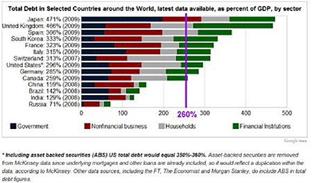
Graph 1
These charts come via Chris Martenson and his excellent blog.
A recent post, the self-explanatorily titled “Death By Debt”, makes the
damning point that we are all trapped in an expanding credit system that has run
into its terminal phase. We are used to living in a financial environment in
which credit has grown exponentially. Global debt has been growing in a “nearly
perfect” exponential fashion throughout the 1970s, the 1980s, the 1990s and the
2000s.
“In order for the 2010 decade to mirror, match, or in any way
resemble the prior four decades, credit market debt will need to double again,
from $52 trillion to $104 trillion.”
Needless to say, this is not going to happen, although there
would appear to be politicians, presidents, intransigent single currency blocs
and bankers out there who believe it might.
“It explains why Bernanke’s $2 trillion has not created a
spectacular party in anything other than a few select areas (banking, corporate
profits) which were positioned to directly benefit from the money. It explains
why things don’t feel right, or the same, and why people are still feeling
queasy about the state of the economy. It explains the massive disconnects
between government pensions and promises, all developed and doled out during the
prior four decades, cannot be met by current budget realities.
“Our entire system of money, and by extension our sense of
entitlement and expectations of future growth, were formed during, and are
utterly dependent on, exponential credit growth.
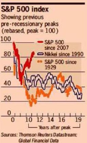
Graph 2
“What will happen when credit cannot grow exponentially?
.Debts cannot be serviced, the weaker and more highly leveraged participants get
clobbered first (Lehman, Greece, Las Vegas housing, etc.) and the dominoes
topple from the outside in towards the centre. Money is dumped in, but traction
is weak. What begins as a temporary programme of providing liquidity becomes a
permanent programme of printing money needed in order for the system to merely
function.”
Note that Martenson uses the word “function” as opposed to,
say, “thrive”. This is because the system has gone beyond the point of no
return.
Fed chairman Bernanke during his June 7th address at the
International Monetary Conference in Atlanta made no explicit mention of
introducing QE3. He did concede that monetary policy rates would be kept at
exceptionally low levels for an extended period, but we already knew that. Like
a consistently spoilt child, the equity market didn’t like what it heard and
went into a sulk. But there is merit in looking beyond the short term to see the
longer term trend. The Financial Times published graph 2 in its weekend
edition last month.
Its impact may not be immediately clear, so let us try and
spell it out like crystal. After two previous historic busts, the S&P 500 (1929
to 1948) and the Nikkei 225 (1990 to, well, today) spent the subsequent two
decades losing up to 80% of their value. In other words, after a colossal boom
and a once-in-a-generation collapse, equity markets can and will disappoint all
those taught to believe in stocks for the long run.
The last several years (the bounce in the red line for the
S&P 500) would seem to diverge from the historic path implied by the other two
graphs. Perhaps the recovery of the last two years was a false one, bought by
the trillions of stimulus poured into the market by a desperate Fed? Time, as
always, will tell.
But if the comparison is a fair one, and we think it is, it
is also time to reflect on what a sensible allocation to equities should be in
the context of a balanced portfolio positioned primarily for capital
preservation. The good news (if any) from the chart is that there is time for
this reflection before deciding just how much, and how fast, to get out of
Dodge.
|
The above data and research was compiled from sources
believed to be reliable. However, neither MBMG International Ltd nor its
officers can accept any liability for any errors or omissions in the
above article nor bear any responsibility for any losses achieved as a
result of any actions taken or not taken as a consequence of reading the
above article. For more information please contact Graham Macdonald on
[email protected] |

