Photography encapsulates art. Every picture, as well as being worth a thousand words, has some art message. And that brings me to the subject this week. Black and White, known more as the simple B&W.
Color photographs only became possible in the 1930’s, yes, about 80 something years ago, whilst B&W has been with us since the very birth of photography.
The stimulus for this week’s article came from Peter Brock, a photographer in Chiang Mai who wrote to me saying, “Peter Brock here up north in Chiang Mai. I liked your article about patterns by the way and one place we all incorporate patterns into our lives whether we are conscious of doing so. For example, the plates and tableware we use affects us, compliments food, etc., and yet few people are conscious of how patterns can make us feel.
“Anyway, I was thinking an article about when to convert an image into black and white might be good for people to consider. Here is the basic idea:
“So, something people might start thinking about at some point is whether color adds or detracts from the intention in making the image? A lot of famous portrait photographers still shoot black and white because the color can be a distraction from the intent of the photograph. When Richard Avedon was making images for an exhibition and book called “The American West”, he shot all black and white images and even though he was shooting portraits in some beautiful countryside, used a white backdrop behind his subject so all the viewer sees is that person — no mountains, lakes, streams, etc.
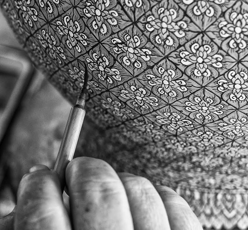
“I have been spending time at a ceramics workshop where I have been buying some tea sets and have been photographing the workers. The work is done 100 percent by hand and each is unique to the artist. For example, I have two mugs that I saw in a cabinet (not in the showroom) and I asked why they were not in the showroom and was told that they are no longer produced because the artist died 24 years ago and with him or her the pattern and skill to paint them. I bought them both for that reason. The whole process is fascinating and shows the incredible discipline of the artists as just one vase can take an artist a month to paint.
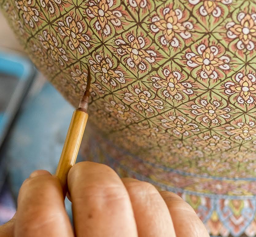
“Attached are two images: the original shot in color, and a virtual copy edited to black and white (and thank you Mr. Photoshop)! (It is not that long ago that I used to have two camera backs for the Hasselblads, one color and the other B&W film.)
“Okay, what I would emphasize to your readers is whether color or black and white suits their intention best. The colored shot is nice, pretty, and most people would leave it like that and be very happy that they even got the detail of the brush in focus. I prefer it in black and white for a couple of reasons: (a) the black and white emphasizes that this is an ancient technique and all hand done, and (b) the intention of the image is to the hand painting and the fine brush she is using freehand. If one looks at the photo with the colors, you can easily get distracted by the colors and begin thinking about whether that green goes with the orange or the blue or any number of other things.”
Thank you Peter, you are correct when you say the same subject printed in color or B&W does give a different message, and as photographers about to set out in a photo shoot they should have worked that out in advance.
Of course, as mentioned previously, there is now no need for two camera bodies, one in color and one B&W any more, unless you are a complete traditionalist (which I am not). Any edit suite has the conversion for you at a click away.
This weekend, take some of your favorite color photos and see the difference when you change from color to B&W. Sorry about the fact this column is on a B&W page of the paper, but try and imagine!

 |
 |
 |


