In the days gone by (pre-digital) it was almost an apprenticeship for all budding photographers to go through developing and printing their own black and white photographs, known as D&P.
The initial step was to develop the light sensitive film to produce negatives. For many enthusiastic souls, this was done by locking themselves in the bathroom, and sealing off all cracks where light might get in. It was never possible to make this 100 percent light proof, so most D&P work would be done at night. With the bath full of chemicals, the film was removed from its canister and the dip and dunk procedure started, moving the film through the chemicals to develop the negative.
After a period of time the developing was ceased with a ‘stop’ bath being used to halt the process. Then there was rinsing and drying. At that stage, the bathroom door could be opened to display a line of people with their legs crossed.
The next stage, the P for printing, was probably the most satisfying. Once again you could not let light to fall on the sensitized paper, but had to do everything under the red ‘safelight’.
We would cut the film into six strips of six negatives, lay them on a sheet of sensitized paper (this was called a ‘contact’ print) and turn on the light for a few seconds, then develop the print in another set of chemicals, dry it and then look at the 36 shots and work out which (if any) were worth printing.
Having made the selection, another sheet of light sensitive paper would be used, and the selected negative projected onto it. Exact focusing was done by looking at the grain in the negative, and then timing to get the best density was worked out, and finally a print could be developed in the ‘soup’. There was also the matter of ‘dodging’ and ‘burning’ where specific areas of the print could be given less or more light, for example to bring out the clouds, in an almost featureless sky.
And all this to produce a black and white print! And about B. 80 for an A4 size print.
Those were the days of ‘real’ photography, where the photographer thought about what the final image would be like, and then made that image happen.
What I would like the weekend photographers to do this weekend is to deliberately go out and take black and white (B&W) images. You will be looking at the subject matter in a different way. Without color contrasts of say a brown dress in front of a blue boat, with B&W that would likely be a grey dress in front of a grey boat.
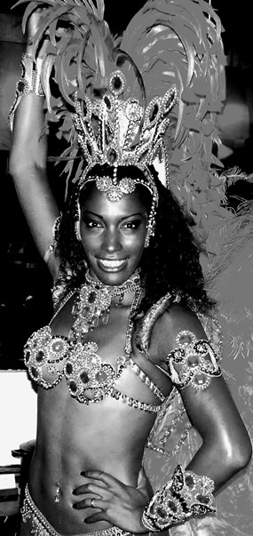
Contrast in photographic composition is an effective means of directing the viewer’s attention to the center of interest.
In B&W photography, contrast is the difference in subject tones from white-to-gray-to-black or from the lightest tone to the darkest tone. Tonal contrast is generally expressed as high contrast which has extreme black and whites, or low contrast which has nothing but graduated greys. The photograph used this week is an example of high contrast. This was not designed to be a portrait, this was designed to be a photograph that hits you between the eyes.
Now you can manipulate a photograph to produce that image. If you have an advanced digital camera, you can program it to record black and white only and then go from there, but if not, fear not, your software will allow you to do this post camera. First convert the color shot to grey scale, then play with the brightness and contrast, and you will very quickly produce a shot like the one used here.
Now high contrast should not be confused with high key. A high key black and white shot is one where the photo shows mostly light tones. Conversely, a low key shot is one that has mainly dark tones. Low key and high key pictures convey mood and atmosphere. Low key suggests seriousness and mystery; high key creates a feeling of delicacy and lightness. A portrait of a blonde in white against a white background is an example of high key.
Try B&W this weekend.


